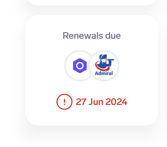
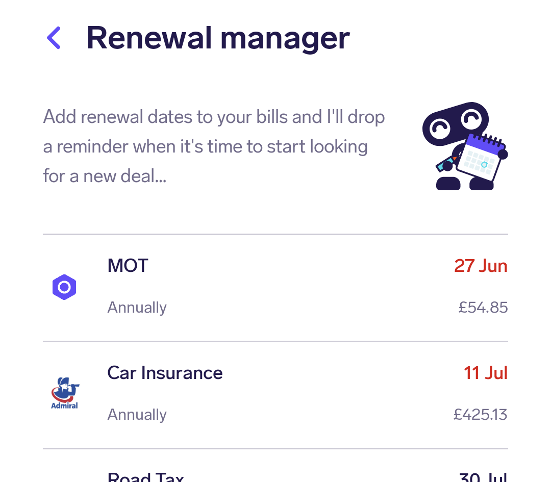
If I click on the 2, it then takes me to the Renewals Manager. This feels clunky and I would have expected Snoop to take me straight to the Renewals Manager page from the Homepage so that I can see what they are and when, then offering me the Switching page, rather than to the Switching page first?
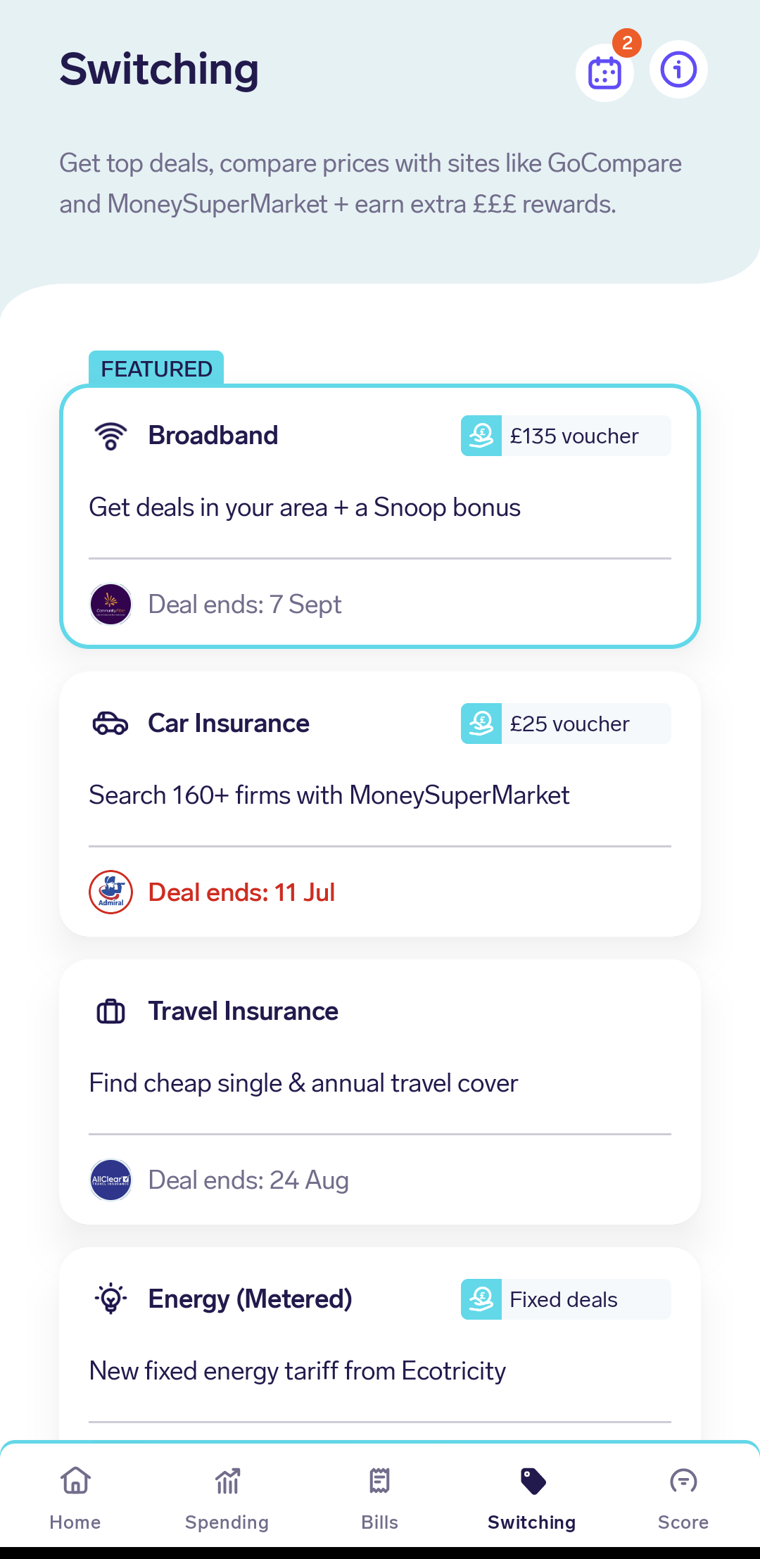
You’re right, there is definitely a more direct experience straight to the renewal manager but we also wanted to make sure we were using the opportunity to highlight our money saving / making deals en route (in case people aren’t aware of a saving they can make on another product).
How are you finding the new homescreen dashboard overall?
I am really enjoying the new homescreen! Probably largely in part because it enables me to see and access key information at a glance without having to go through too many other screens, hence why I’m probably getting annoyed with this renewals click!